Optimizing a website to be fully-responsive on mobile devices is the modern standard when it comes to web design. With over 50% of web traffic coming from mobile devices in 2022, it is critical to have a site that looks beautiful and sleek on smaller screens as well.
Luckily for you, ManageCasa’s editor allows you to edit your site in all three of the most common viewports. You can review each of your pages in web, tablet, and mobile screen sizes, and then determine if you need to move or hide any content to optimize the layout in each.
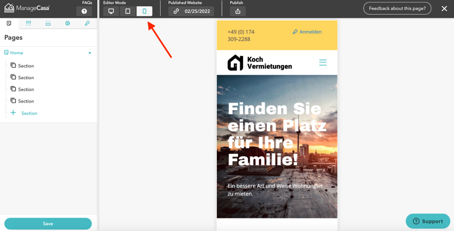
Use the Editor Mode section in the top left hand corner of the editor to change the viewport of the editor. We recommend reviewing every page you create in all three viewports to ensure you are satisfied with the display.
Tablet View:

Mobile View:

The most common edits you will want to make in smaller viewports are adjustments to the margins and spacing of elements. You may also want to hide certain elements altogether.
When you select any content element in the left-hand editor you can adjust its margins and spacing as you see fit.
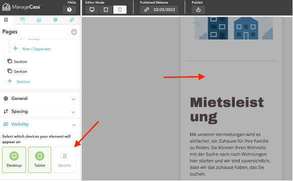
To hide it in a certain viewport, open the Visibility section and then deselect the viewports for which you would like to hide the element.
Example: Image element selected, defaulted to show on all viewports

Example: Image element selected, no longer shown on mobile

Still have questions?
Open the Support conversation icon on the lower right corner and ask us anything.
Comments
0 comments
Please sign in to leave a comment.